There is psychology behind the use of color. Different colors convey different things when worn. White usually signifies purity, while navy blue represents strength and dependability. When trying to maximize your image and influence, color is extremely important. Clothing and colors should enhance the best features of the person wearing them. Wearing the wrong color combinations can draw attention to the clothes, and not the individual. The wrong colors can even accentuate negative features like wrinkles.
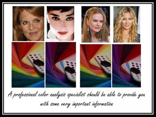
A personal color analysis will determine the best color combinations to enhance a person’s distinct features and individual coloring. Color analysis will also show how to downplay negative features. There are general rules that apply to almost everyone when it comes to color. For instance, wearing monochromatic hue like all black makes almost anyone appear thinner. The following are a few color combinations and how these colors may affect the individual wearing them.
Achromatic Color Combinations

Achromatic colors basically lack hue. These colors fall along the spectrum of black and white, and all the gray shades between. Wearing achromatic color combinations create a polished, professional look, with a touch of elegance. A color analysis would reveal which shades of gray, or combinations of black and white, enhance each individual’s best features.
Analogous Color Combinations

Analogous colors are adjacent to each other on the color wheel. One is a dominant color, while the other is complimentary. An example would be wearing a yellow dress with an orange jacket. These combinations tend to create a balanced, even look.
Monochromatic Color Combinations

A monochromatic color scheme uses one color with varying shades and intensities. This can be a great look both professionally and socially. This particular color scheme creates the illusion of being taller and thinner.
Complimentary Color Combinations

Complimentary colors are directly across from each other on the color wheel. Red and green would be an example of complimentary colors. Split complimentary colors are often worn to create interest and grab attention. Choose a color, find its complimentary color, on the opposite side of the color wheel then pick the two colors on either side of the complimentary color. These are split complimentary combinations.

Fabric & Texture
A good personal color analysis would likely provide information on fabrics and textures. Fabrics that are smooth and flat can make a person look thinner. Fabrics that are bulky or reflect light will make a person look larger.
To learn more about The Universal 4X4 color System ? (16 seasons)? or to find out what is your best colors, combination and texture call us today!