4X4 Shaded Spring Color Swatch
$70.00
A silk-lined physical palette for Shaded Spring with 60 warm, deeper-value Spring shades and printed pairing tips—ideal for rich yet radiant style.
-
60 curated Shaded Spring colors
-
Silk-lined durability
-
Tips on each swatch
-
Medium contrast with depth
-
Optional bundle with digital swatch
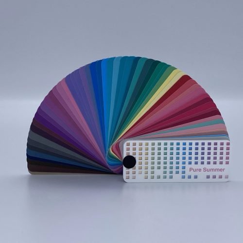
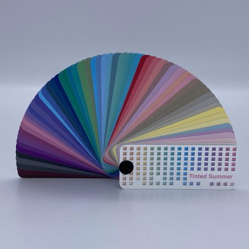
Description
Warmth with presence—introducing the 4X4 Shaded Spring Color Swatch – Physical Palette. If you’re a Spring who reads warm, clear, and deeper in value (for Spring), this is your confident lane. The palette serves peach, apricot, light orange, soft teal, warm greens, and glow-friendly earthy neutrals—all curated into a silk-lined swatch book that stands up to studio days, shopping trips, and back-to-back client consults. Expect medium contrast combinations anchored in warm lights and richer supports for a chic, quietly dramatic take on Spring.
The Shaded Spring DNA
In 4×4 terms, “Shaded” adds a touch of black to deepen value. You still want warmth and clarity, but you can carry richer anchors (e.g., junior navy, olive, warm brown, terracotta) with ease. Your best light neutrals include Ivory, Cream, Light Warm Beige, Light Warm Gray, Buff, and Camel; your best darks include Tan, Coffee, Warm Brown, Soft Rust, Terracotta, Olive, Junior Navy, Teal, Khaki. Medium contrast pairings—like marine navy + lighter blue or camel + darker brown—look especially polished.
Inside the physical swatch
-
60 Shaded Spring shades arranged for quick, intentional pairing.
-
Silk-lined construction for durability and color integrity under heavy use.
-
Printed guidance on each swatch to accelerate decision-making.
-
Compact, travel-ready deck for handbags and pro kits.
How to use it (quick wins)
-
Wardrobe: Choose a warm dark neutral (e.g., coffee/olive/junior navy) and add a lighter Spring color (e.g., apricot, light teal) to create medium contrast with depth. Favor light textures and gentle sheen—very heavy weaves can mute Spring warmth.
-
Makeup: Bases porcelain–warm/medium beige; blush salmon/cinnamon/peach/russet; lips warm red, coral, russet, warm browns/apricot (semi-gloss or cream); highlights for eyes lemon yellow/sand/melon/apricot with contours moss/spruce/sage/bronze/teal/gray; liners aubergine/charcoal/teal/dark brown/navy/purple; mascara dark brown for harmony.
-
Accessories: Rose/bright yellow golds and classic gems (diamonds, sapphires, rubies, emeralds) enhance Shaded Spring’s glow; eyewear in shiny golds, copper, turquoise, light russet, purple keeps balance.
On black
Black worn alone isn’t ideal for Shaded Spring, but it can look striking when managed: keep it away from the face, add warm light neutrals (ivory, light warm gray), or break it with gold jewelry. Most Shaded Spring colors will soften and balance black’s strength.
Hair/eyes & seasonal shifts
Warm blondes to light/medium auburns sit naturally here; pushing hair very light can read Tinted, while cooler choices may blur the Spring warmth. Lenses in blue/teal/hazel/green/turquoise stay aligned; brighter blue may skew Pure Spring, and softer green can feel more Toned—adjust makeup accordingly.
Why physical matters
Deeper Spring harmonies depend on value control and undertone. A physical, color-managed swatch is your anchor when lighting changes or cameras roll, ensuring repeatable, confident results.
Additional information
| Weight | 0.1625 lbs |
|---|---|
| Dimensions | 3.5 × 1.5 × 1 in |