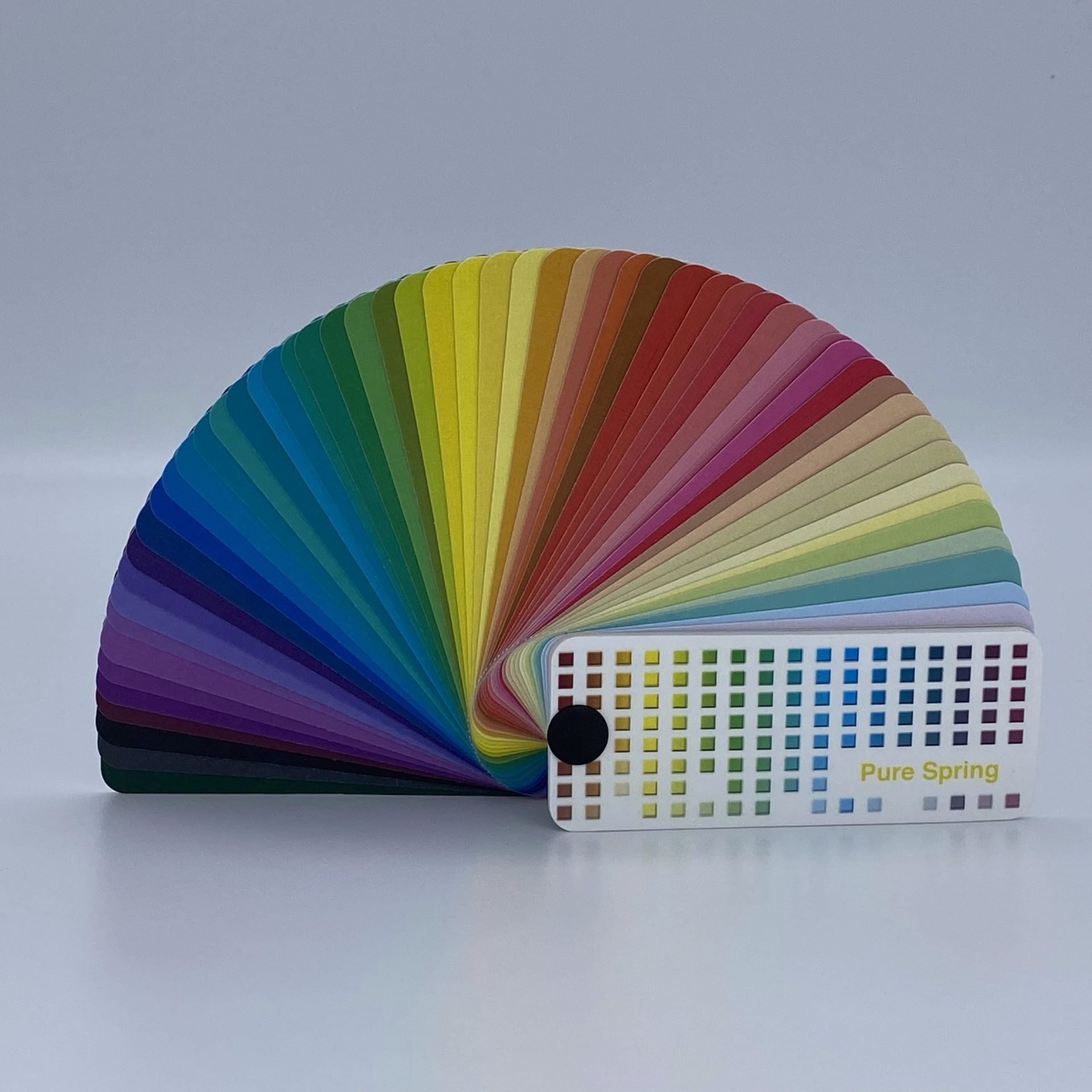
4X4 Pure Spring Color Swatch
$70.00
A silk-lined physical palette for Pure Spring with 60 warm, clear, light shades and printed pairing tips—ideal for wardrobe, makeup, and styling in real-world lighting.
-
60 curated Pure Spring colors
-
Silk-lined durability
-
Tips on every swatch
-
Medium–high contrast made easy
-
Optional bundle with digital swatch
Description
Light, bright, and joyfully clear—meet your on-the-go guide to confident color: the 4X4 Pure Spring Color Swatch. If your natural coloring thrives on warm undertones, clear chroma, and light value, Pure Spring is your home base. This silk-lined swatch book brings together 60 precisely curated shades that flatter Pure Spring features in real-world lighting—so you can evaluate fabrics, cosmetics, and accessories where it matters most: in stores, studios, or on set. Expect luminous clarity, crisp contrast, and an invigorating mood that mirrors blooming gardens and sun-washed skies.
The Pure Spring DNA
In the 4×4 Color System®, “Pure” denotes each season’s most saturated, high-energy colors. For Pure Spring, that means warm, clear, and light—a spectrum of lively brights and clean neutrals that never look dusty. Think jade, coral, parrot green, true red, lime, turquoise, and true blue for impact, supported by versatile anchors like navy, camel, charcoal, mahogany, and chocolate brown. What to avoid? Anything muted or gray-cast, which can dull your radiance.
Neutrals, contrast & coordination
Pure Spring handles medium to high contrast beautifully—pair a deep anchor with a clear, bright accent for snap and structure. Your best light neutrals include Ivory, Soft White, Cream, Light Warm Gray, Beige, Stone, and Tan; your best darks include Brown-Black, Forest Green, Charcoal, Navy, Rich Olive, and Coffee. These are ideal for building a capsule wardrobe, mixing three-color looks, or balancing prints.
Inside the physical swatch
-
60 Pure Spring shades arranged for quick pairing.
-
Silk-lined construction that protects color fidelity during heavy, daily use.
-
Printed tips on the back of each swatch for instant mix-and-match decisions.
-
Compact, travel-friendly format for handbags, kits, and client work.
How to use it (quick wins)
-
Wardrobe: Start with navy or camel, then add a bright (e.g., turquoise, coral, true red) near the face. Opt for light textures and shiny/reflective fabrics (silk, satin) to mirror Spring’s energy—heavy textures can mute your coloring.
-
Makeup: Bases in porcelain through warm/medium beige; blush in salmon, russet, strawberry, apricot; lips in warm red, coral, russet, warm pink; eyes with champagne/sand/soft pink highlights and contours in teal, warm smoky green, Chinese blue; liners in aubergine, charcoal, teal, dark brown, navy, purple; mascara brown or black depending on depth.
-
Accessories: Favor bright gold/rose gold and sparkling gemstones (diamonds, sapphires, rubies, emeralds); eyewear in shiny golds, Chinese blue, teal, copper adds lift.
Black—yes, but thoughtfully
Black is not a palette color for Pure Spring, yet it can be leveraged for contrast. Keep it away from the face (lower necklines), break it up with bright jewelry, or buffer with warm lights like tan, coffee, or teal.
Hair/eyes & seasonal shifts
Choose hair within the medium–dark brown, auburn, or golden-blonde family to preserve harmony. Bright blue or teal contacts keep you in Spring; cooler/softer lenses can shift you toward Tinted Spring, while intense greens may nudge you toward Shaded Spring. As you age, softening value/contrast can tilt you toward lighter or softer Spring variants; color choices can help you stay aligned.
Why a physical swatch matters
Screens and store lights shift perception. A color-managed, physical reference anchors your decisions and helps clients (or your future self) replicate wins consistently—wardrobe to makeup to events.
Additional information
| Weight | 0.1625 lbs |
|---|---|
| Dimensions | 3.5 × 1.5 × 1 in |